The aim of this post is to give a very basic framework for making vowel density charts. I recently learnt how to make them, and I think they’re a really neat way of showcasing vowel data, particularly their spread in the vowel space.
Let’s load in some word list data that I recorded in Praat and force-aligned in DARLA.The most important thing to have in your data frame for this kind of plot is both F1 and F2 measurements, ideally normalised. I normalised this data using the Lobanov method on the NORM website. We’ll be using ggplot, so I’ve also loaded Tidyverse.
library("tidyverse")## ── Attaching packages ─────────────────────────────────────── tidyverse 1.3.2 ──
## ✔ ggplot2 3.4.0 ✔ purrr 0.3.5
## ✔ tibble 3.1.8 ✔ dplyr 1.0.10
## ✔ tidyr 1.2.1 ✔ stringr 1.5.0
## ✔ readr 2.1.3 ✔ forcats 0.5.2
## ── Conflicts ────────────────────────────────────────── tidyverse_conflicts() ──
## ✖ dplyr::filter() masks stats::filter()
## ✖ dplyr::lag() masks stats::lag()vowels <- read.csv("C:/Users/Aussuie/Dropbox/ANU/Website/Website/Data_normalised.csv")
head(vowels)## Speaker Vowel Context F150_lob F250_lob F180_lob F280_lob
## 1 ES_2021 IY HEED -0.604 1.792 -0.739 1.759
## 2 ES_2021 IY HEAT -1.262 2.170 -1.355 0.973
## 3 ES_2021 IY HEEL -0.792 1.310 -0.498 -0.143
## 4 ES_2021 IY BEAN -1.084 2.099 -1.156 1.891
## 5 ES_2021 IY HE -1.062 2.096 -1.400 1.944
## 6 ES_2021 EY PAID -0.389 1.506 -0.838 1.561This is all the vowels in together. The basic framework of a vowel density plot is F2 along the horizontal axis and F1 along the vertical axis (as per a standard vowel chart). Don’t forget to reverse the scale of the x and y axes as well. Then, geom_density_2d() adds in the contours of the plot. I’ve also manually adjusted the limits of the x and y axes because they were being cut off.
ggplot(vowels, aes(x=F250_lob, y=F150_lob)) +
  geom_density_2d()+
  scale_y_reverse()+
  scale_x_reverse()+
  expand_limits(x = c(2.5, -2.5),y=c(3.5,-2))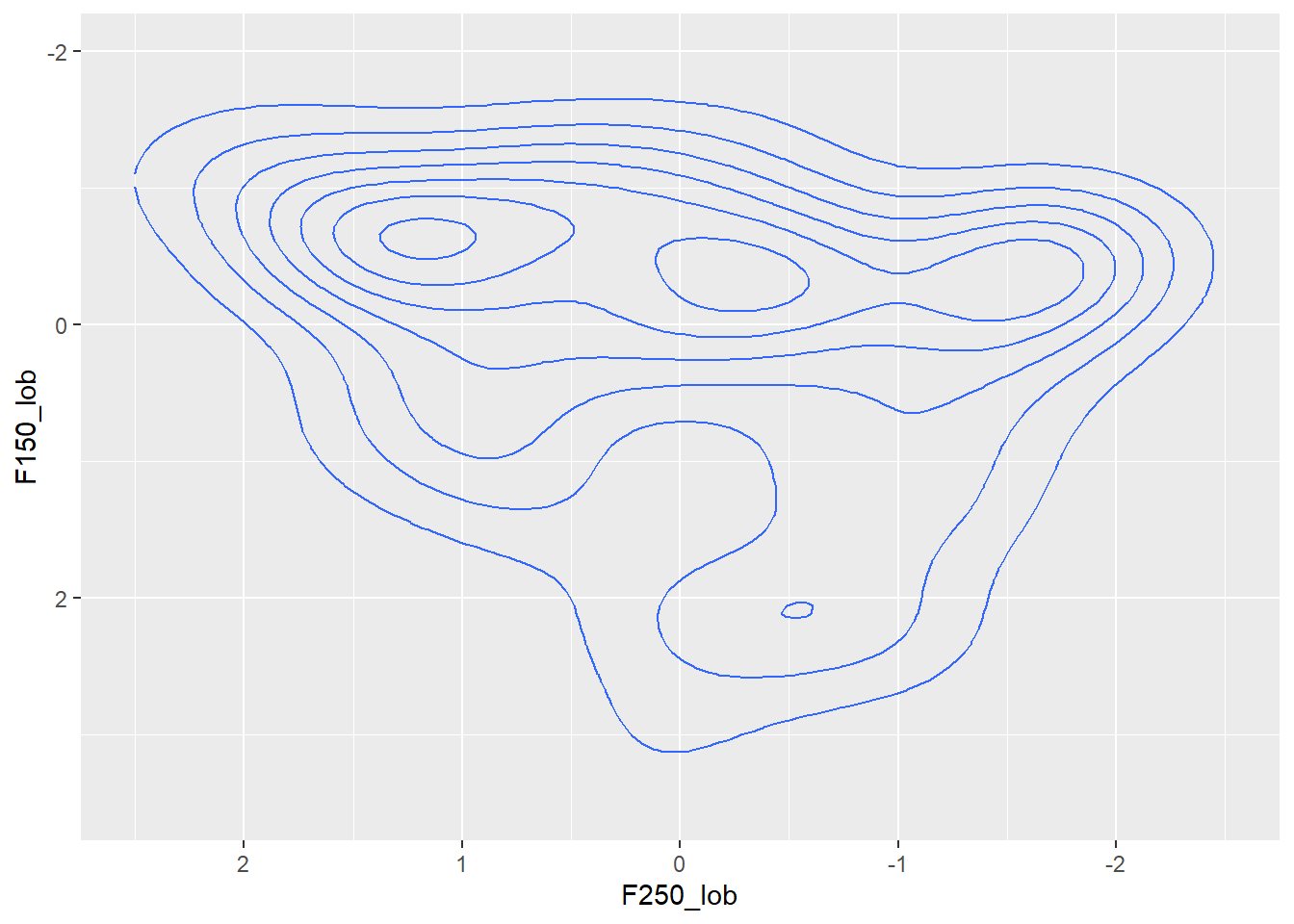
Here I’ve taken just the short front monophthongs “IH” (KIT), “EH” (DRESS) and “AE” (TRAP) and differentiated each vowel by colour.
sfv <- vowels %>%
filter(Vowel %in% c("IH","EH","AE"))
ggplot(sfv, aes(x=F250_lob, y=F150_lob)) +
geom_density_2d(aes(color=Vowel))+
scale_y_reverse()+
scale_x_reverse()+
expand_limits(x = c(2.25, -1.5),y=c(4.5,-1.5))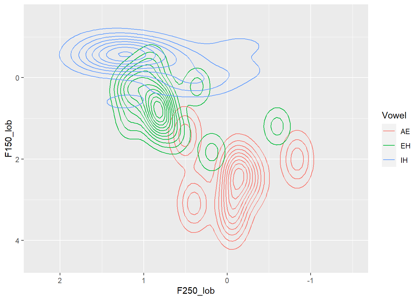 Here’s a look at most of the monophthongs “IH” (KIT), “EH” (DRESS), “AE” (TRAP), “ER” (NURSE), “UW” (GOOSE), “UH” (HOOD) “AO” (THOUGHT/FORCE), “AA” (LOT/START/BATH), “AH” (STRUT)
monop <- vowels %>%
  filter(Vowel %in% c("IH","EH","AH","UH","AE","AA","ER","AO","UW"))

ggplot(monop, aes(x=F250_lob, y=F150_lob)) +
  geom_density_2d(aes(color=Vowel))+
  scale_y_reverse()+
  scale_x_reverse()+
  expand_limits(x = c(2, -2),y=4)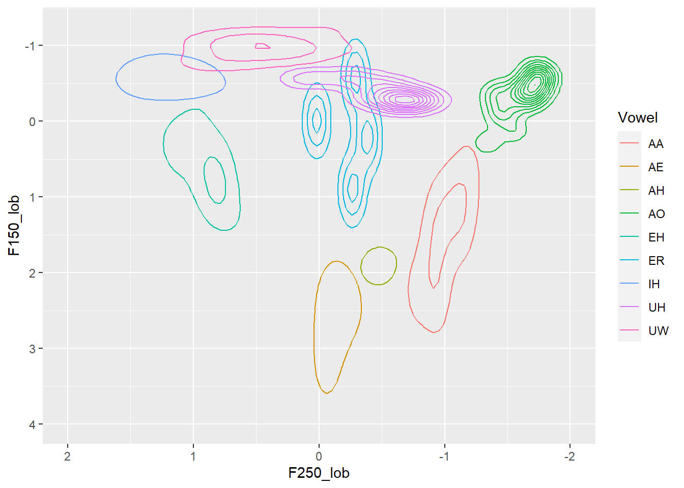
This is pretty rough and ready, and if I’m honest I’m not sure why the number of lines decrease for the short front vowels in this graph relative to the previous one. I suspect it has something to do with the number of data points and the relative distance between them for different vowels.
But, something neat you can see is that my vowels system doesn’t quite align with the dictionary used by the DARLA forced alignment: the AA covers both my ‘LOT’ and ‘BATH/START’ vowels, which are distinct in my system but merged in a number of North American varieties.
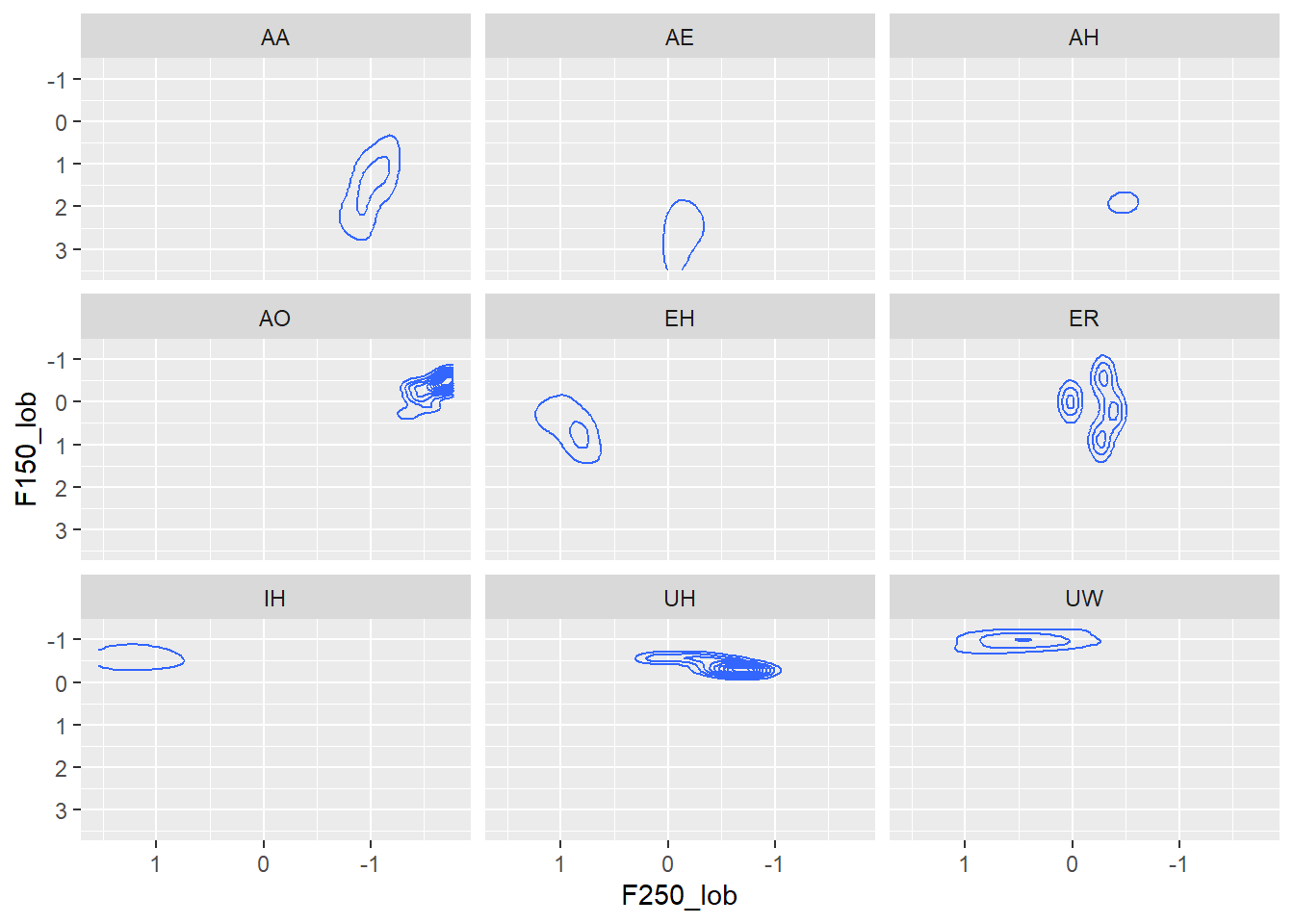
Now I only have data from myself here, but if you have multiple speakers, or multiple speakers of different genders or from different communities or class groups, you can also break up the visualisation according to the factor levels with facet_wrap(~variable) or change the colours.I’ve faceted by vowel in the chart below to illustrated what the code does, but I don’t claim it as a good or helpful visualisation.
ggplot(monop, aes(x=F250_lob, y=F150_lob)) +
  geom_density_2d()+
  scale_y_reverse()+
  scale_x_reverse()+
  facet_wrap(~Vowel)