This is an adaptation of a workshop I ran last year as part of the Centre of Excellence for the Dynamics of Language (ANU) Seminar Series- the main change is that I’ve subbed out the data with the iris data that’s automatically available in R so that it’s more accessible. If you would like a recording of the workshop, which uses vowel data, you can email me at elena.sheard@anu.edu.au
Workshop Overview
- Introduction to the ggplot2 package and its main functions
- How to make three plots
- Scatter plot
- Box plot
- Density plot
- How to customise these plots
- Colour
- Labels
- Legends
- Themes
- Faceting
- Manual palettes
The Basics
ggplot2 is a R package dedicated to data visualisation
Has an underlying grammar that allows you to build graphs by combining independent components
- This allows you to build almost any type of chart
- The same underlying data can be transformed by many different scales or layers (i.e., it is extremely flexible)
It is also over a decade old, meaning there are a lot of resources available
To use ggplot2, you need to:
- Install and load either the ggplot2 package or the tidyverse package
- Load the data (
name_of_object <- read.csv("name_of_spreadsheet.csv"))
I have also included code for installing and loading the RColorBrewer package
install.packages("tidyverse")
install.packages("RColorBrewer")
library(RColorBrewer)
library(tidyverse)
The base layer
- All plots are composed of:
- The data: the information you want to visualise
- A mapping: a description of how you want the variables in your data to be ‘mapped’ to aesthetic attributes like colour, shapes, or x and y axes
- All plots you make in ggplot2 will begin with the
ggplot()function- This builds the first component of your graph (the base layer)
- This builds the first component of your graph (the base layer)
- You also need to tell ggplot what data you want to visualise
- The name of your dataframe or object, in our case ‘cars’
- The name of your dataframe or object, in our case ‘cars’
- The code below will create an empty base layer
ggplot(data = iris)
Mapping
- Mapping depends on what kind of graph you are after, but for most you will want to add x and/or y axes
- Within
ggplot(data=ban), we need another functionaes()within which you give the x and y axes so that:ggplot(data=*dataframe*, aes(x=*column_a*, y=*column_b*))- The names you give for ‘x’ and ‘y’ are the names of the columns in the dataframe you want to plot
- The code below will create a graph with a labeled x and y axis that is otherwise empty. In the next section, we will turn it into a scatter plot
ggplot(data = iris, aes(x = Sepal.Length, y = Petal.Length))
Three Basic Plots
Basic scatter plot
- We already have the basis for a scatterplot from the previous code as we have two continuous variables on the x and y axes
- To turn this into a scatterplot, add
+ geom_point()to the previous code- This tells ggplot2 that we want to build a scatter plot, with the specified x and y axes
- When you add a new component to a graph, there must be a
+connecting to the previous one - And voila!
ggplot(data = iris, aes(x = Sepal.Length, y = Petal.Length)) +
  geom_point()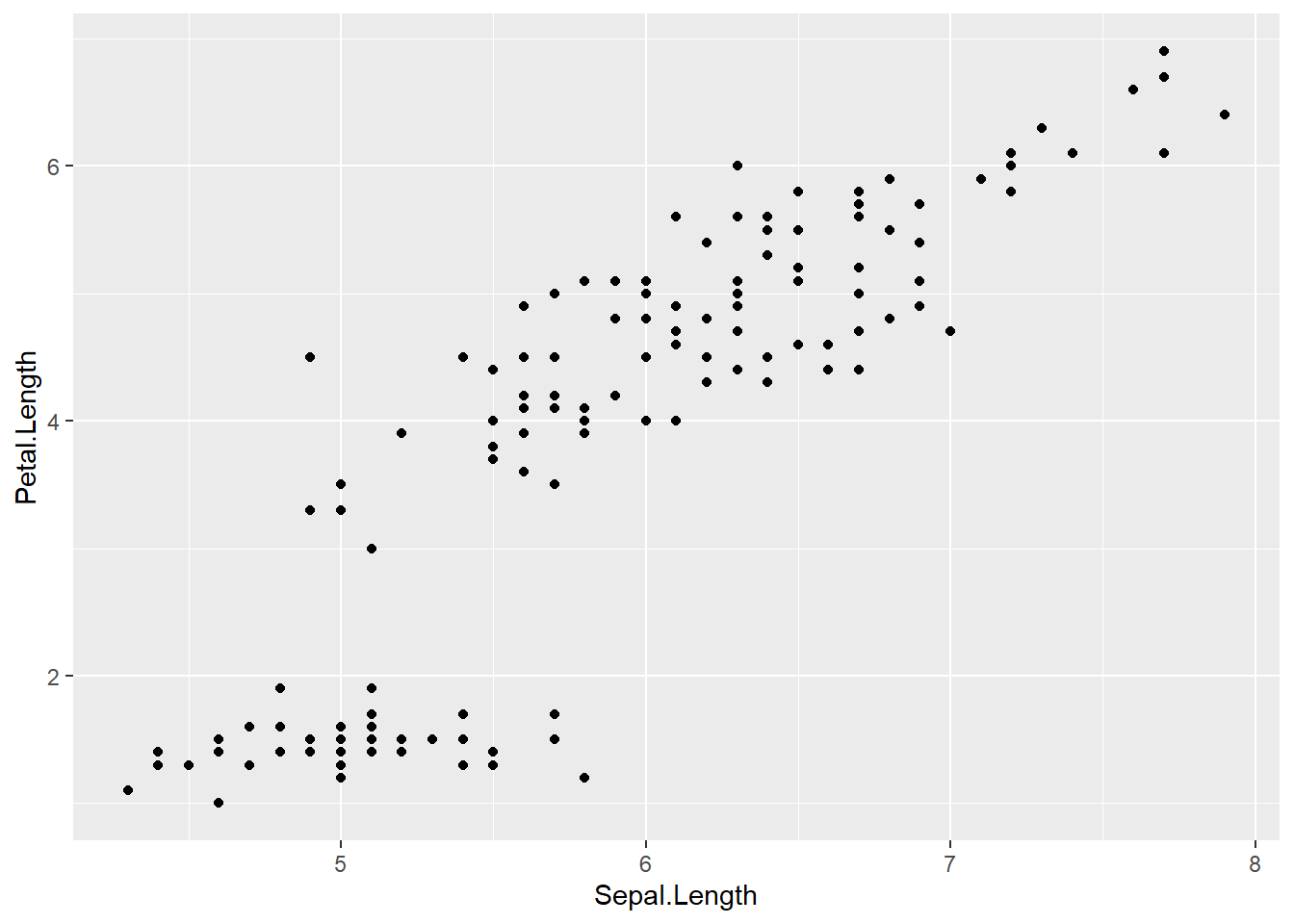
Basic boxplot
- The basic
ggplot(data=, aes(x=,y=))stays the same- Instead of
+geom_point()we add+geom_boxplot()
- Instead of
- Box plots use:
- a categorical variable on the x axis
- a continuous variable on the y axis
ggplot(data = iris, aes(x = Species, y = Petal.Length)) +
  geom_boxplot()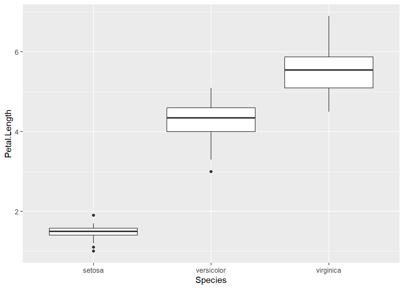
Basic density plot
- The basic code is
ggplot(data=, aes(x=))- This time we add
+geom_density()
- This time we add
- Density plots use:
- a single continuous variable on the x-axis
- Y axis tells you the distribution of this variables
ggplot(data = iris, aes(x = Petal.Length)) +
  geom_density()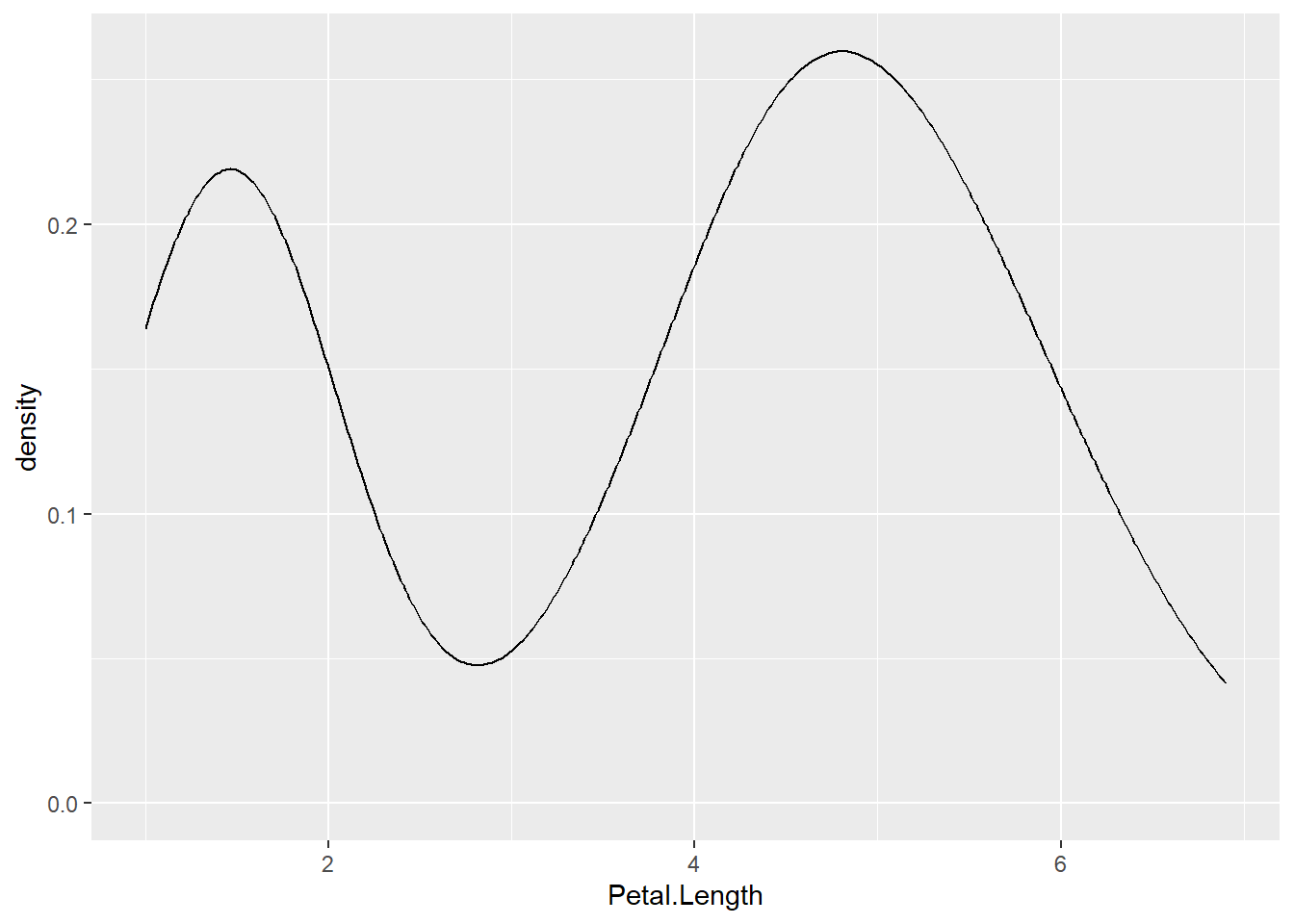
Practice Mini-Tasks
1: Build a scatter plot
- Make your own scatter plot by changing the x and y axes to different continuous variables from the data:
- Petal.Length
- Petal.Width
- Sepal.Length
- Sepal.Width
2: Build a box plot
- Make your own box plot by changing the y axis to different continuous variables from the dataframe:
- Petal.Length
- Petal.Width
- Sepal.Length
- Sepal.Width
- And change the x axis to a different categorical variable from the dataframe (although with this data there is only one option)
- Species
3: Build a density plot
- Make your own density plot by changing the x axis to a different continuous variable from the dataframe
- Petal.Length
- Petal.Width
- Sepal.Length
- Sepal.Width
Customising in ggplot2
Colour
- Colour is a very easy way to add additional information
- We map colour to variables within the
aes()function, after we have put in the x and y axesggplot(data=data_frame, aes(x=columm_a,y=column_b,color=column_c))
- The same principle applies to shape and linetype
ggplot(data = iris, aes(x = Sepal.Length, y = Petal.Length,
                        color = Species)) +
  geom_point()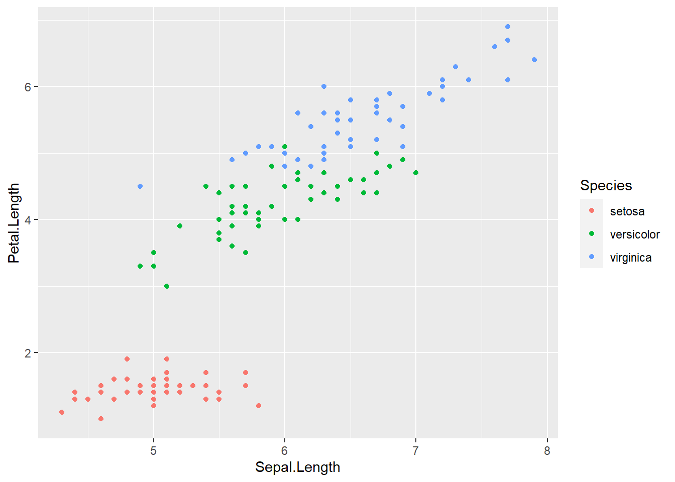
- If your graph has shapes with lines (like boxplots and density plots), you can:
- change the line colour with
color=column_c - change the colour inside the lines with
fill=column_d
- change the line colour with
ggplot(data = iris, aes(x = Sepal.Length, color = Species))+
  geom_density()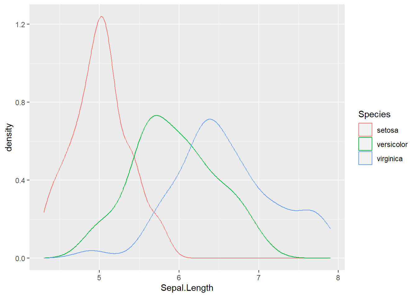
ggplot(data = iris, aes(x = Sepal.Length, fill = Species)) +
geom_density()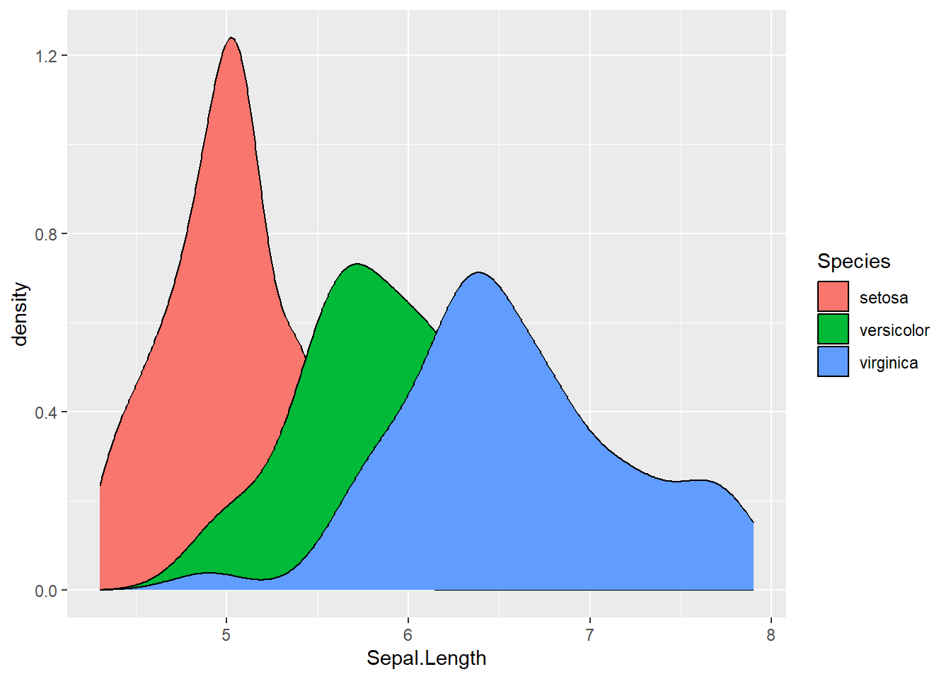 ### Labels and Titles
- The
+labs()function lets you change the plot title, caption, x and y axes and the legend labelslabs(title = "Plot Title", caption = "Plot Caption", x = "column_a", y = "column_b", color = "column_c", fill = "column_d")
- To change the legend labels, you specify the mapping attribute (color or fill), then the column being mapped to that attribute
ggplot(data = iris, aes(x = Sepal.Length, y = Petal.Length,
                        color = Species)) +
  geom_point() +
  labs(title = "Sepal Length and Petal Length",
      caption = "Data from R",
      x = "Sepal Length", y = "Petal Length",
      color = "Species")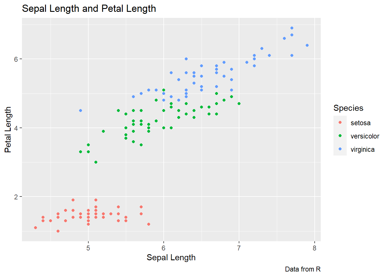
Themes
- You can change the background of the chart
- Grey squares is the default
- Other options include:
+theme_bw(),+theme_light(),+theme_dark(),+theme_classic()
ggplot(data = iris, aes(x = Sepal.Length, y = Petal.Length,
                        color = Species)) +
  geom_point() +
  labs(title = "Sepal Length and Petal Length",
      caption = "Data from R",
      x = "Sepal Length", y = "Petal Length",
      color = "Species")+
  theme_bw()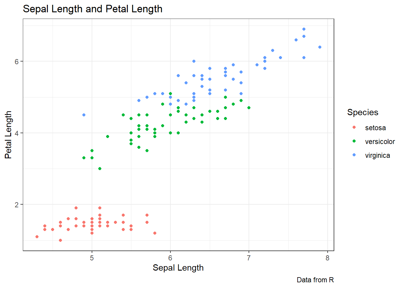
Legends
- The default legend position is to the right of the plot
- It can be changed using
+theme(legend.position="")- Options are “bottom”, “top”, “left”, or “right”
- You can also alter the legend name and labels using:
scale_color_discrete(name="",labels=c("",""))andscale_fill_discrete(name="",labels=c("",""))- You can remove one of the legends if you have more than one with
guides(fill="none")orguides(color="none")- Need to specify the mapping you want to remove
- If you want to remove all legends you can use
+ theme(legend.position="none")
ggplot(data = iris, aes(x = Sepal.Length, y = Petal.Length, color = Species)) +
  geom_point() +
  labs(title = "Sepal Length and Petal Length",
      caption = "Data from R",
      x = "Sepal Length",y = "Petal Length",
      color = "Species") +
  theme_bw() +
  theme(legend.position = "left")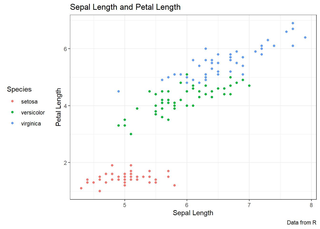
Mini-tasks: Customising your chart
1: Colour
- Customise a scatter plot, box plot and density plot with colour
- Scatter plot
ggplot(data = data_frame, aes(x = column_1, y = column_2, color = column_3)) + geom_point()
- Box plot
ggplot(data = ban, aes(x = age, y = F1_lob, color = gender, fill = community)) + geom_boxplot()
- Density plot
ggplot(data = ban, aes(x = F1_lob, color = age, fill = community)) + geom_density()
2: Customising with colour
- Customise a scatter plot, box plot and density plot with colour
- Scatter plot
ggplot(data = data_frame, aes(x = column_1, y = column_2, color = column_3)) + geom_point()
- Box plot
ggplot(data = ban, aes(x = age, y = F1_lob, color = gender, fill = community)) + geom_boxplot()
- Density plot
ggplot(data = ban, aes(x = F1_lob, color = age, fill = community)) + geom_density()
3: Labels and Titles
- Give your plot from Task 4 a new title!
- Try and change the labels of the x and y axes too
- Previous plot code +
labs(title = "Plot Title", caption = "Plot Caption", x = "column_a", y = "column_b", color = "column_c", fill = "column_d")
- Previous plot code +
4: Theme
- Change the theme for the plot from Task 5
+theme_bw()+theme_light()+theme_dark()+theme_classic()
5: Legends
- Change the labels for your legend
- Try and remove one of them if you have two
Faceting
facet_wrap()
- You can break down your graph further by categorical variables with
facet_wrap(), which automatically wraps graphs in a rectangle layout facet_wrap(~)can take one or two arguments- for one argument, it goes to the right of the ~
facet_wrap(~ column_e) - for two arguments, one goes on either side of the ~
facet_wrap(column_e ~ column_f)
- for one argument, it goes to the right of the ~
ggplot(data = iris, aes(x = Sepal.Length, y = Petal.Length)) +
  geom_point() +
  labs(title = "Sepal Length and Petal Length",
      caption = "Data from R",
      x = "Sepal Length", y = "Petal Length",
      color = "Species") +
  theme_bw() +
  facet_wrap(~ Species)
facet_grid()
facet_grid()can facet into columns or rows, or bothfacet_grid(cols = vars(column_e))will facet into columns based on this variablefacet_grid(rows = vars(column_f))will facet into rows based on this variablefacet_grid(cols = vars(column_e), rows = vars(column_f))will facet into rows and columns based on the two variables
ggplot(data = iris, aes(x = Sepal.Length, y = Petal.Length))+
  geom_point() +
  labs(title = "Sepal Length and Petal Length",
      caption = "Data from R",
      x = "Sepal Length", y = "Petal Length",
      color = "Species") +
  theme_bw() +
  facet_grid(cols = vars(Species))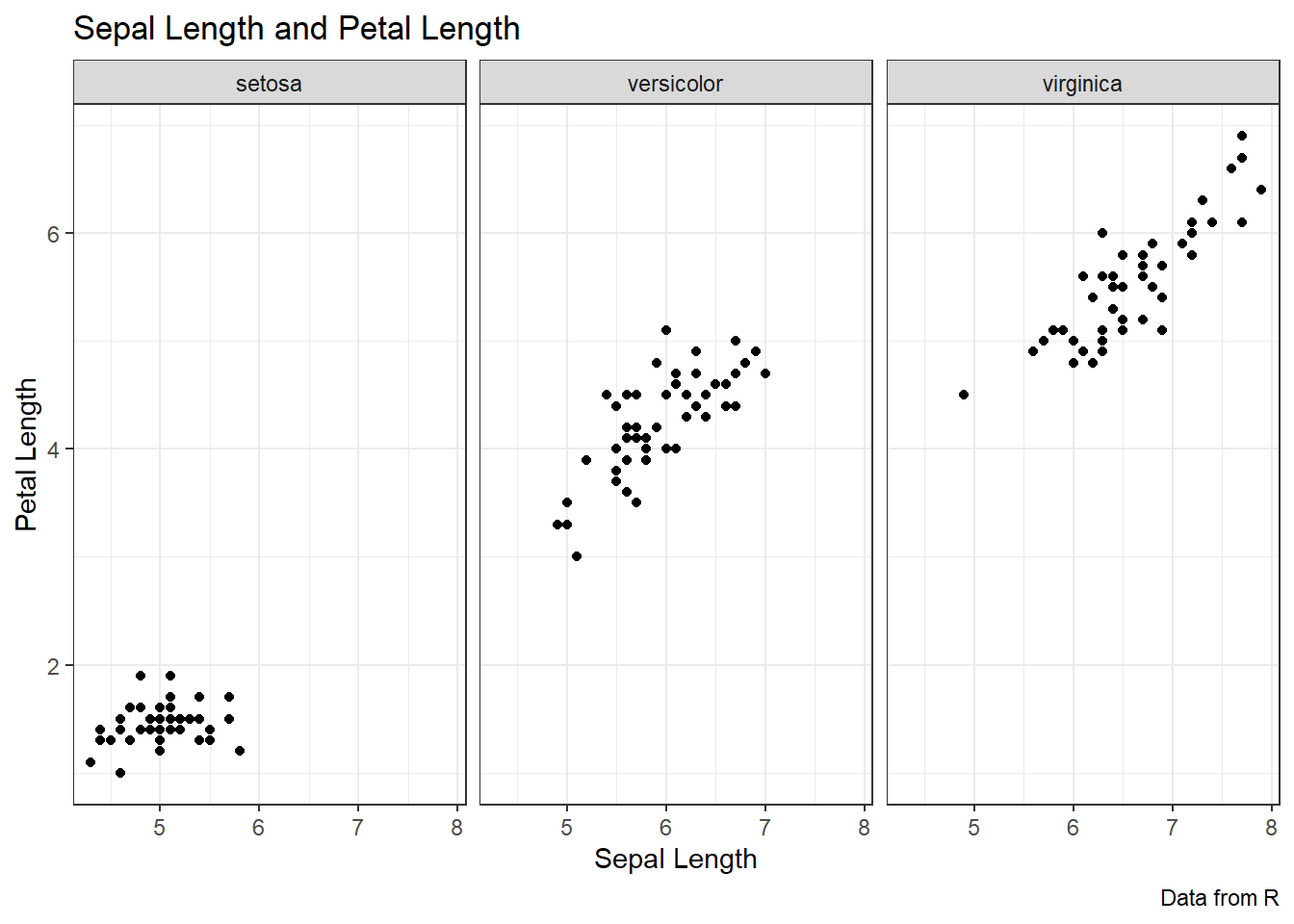
Changing the colours
- When you map variables onto colour, R will automatically select colours for you
- But often it’s not cute or doesn’t match the colour scheme of your presentation
- ggplot lets us change the colours. You can:
- Manually select each colour within the plot
- Choose a pre-existing palette
Manually selecting colours
- Get a list of the available colour names with
colors() - Or you can use the Hex code for the colour
- To change the colours in a plot manually we add
scale_color_manual()- Inside the () we add
values=c()with the colour names or hex codes in “” - When using hex codes, remember to have the # in front of the code
- Inside the () we add
ggplot(data = iris, aes(x = Sepal.Length, y = Petal.Length, color = Species)) +
  geom_point() +
  scale_color_manual(values = c("blue2", "chartreuse2", "blueviolet"))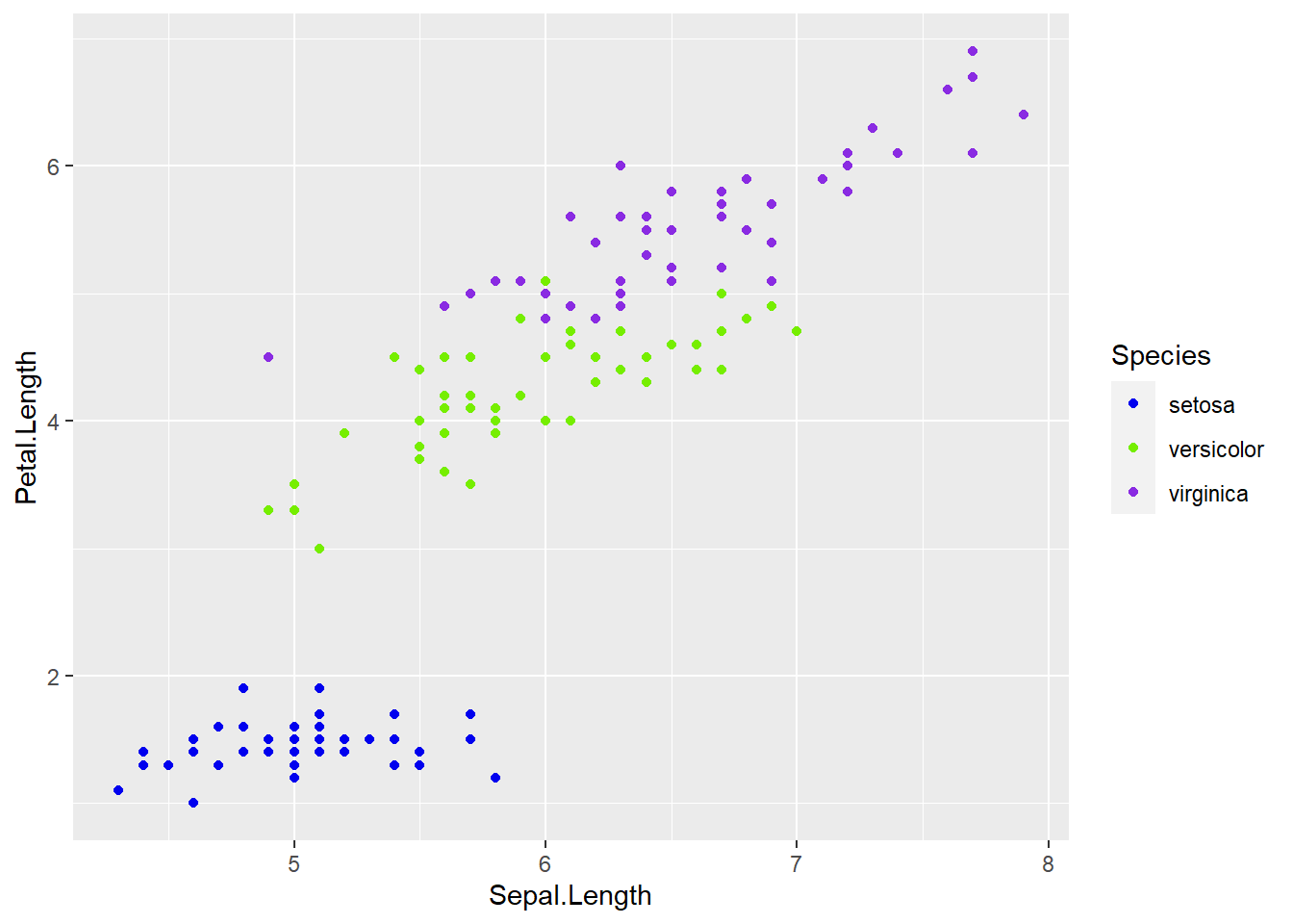
- Where you have both fill and colour, the same applies
- To change the fill colour manually add:
+scale_fill_manual(values = c())
- To change the line colour manually add:
+scale_color_manual(values = c())
Pre-existing palettes
- You don’t need to go through choosing colours manually if you don’t want to
- There are a lot of pre-existing palettes that you can add to your graph
- Different packages have different palettes, I use RColorBrewer
- We replace the ‘manual’ in the previous code with
brewer:scale_color_brewer(palette = "")
scale_fill_brewer(palette = "")
- You can find palette names in the link in the script
ggplot(data = iris, aes(x = Sepal.Length, y = Petal.Length, color = Species)) +
  geom_point() +
  scale_color_brewer(palette = "RdGy",
          name = "Iris Species")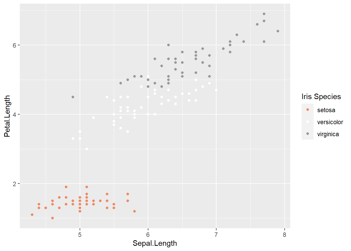
Mini-tasks: Make it cute and bring it together
1: Make it cute
- Manually change the colours in a chart by changing the colours manually, or using a pre-existing palette _ You can copy and paste a graph from above!
2: Bring it together
- Construct a box plot, density plot or scatter plot (i.e. copy and paste from different tasks)
- Change the theme
- Change the title and labels (axes and legend)
- Change the legend (presence or position)
- Facet it by one or two categorical variables
- Customise the colours manually or with a pre-existing palette
Troubleshooting
- Remember to have colour and palette names/hex codes in ” ”
- “” and () have to be closed
- R is case-sensitive and space-sensitive
- there must be a
+connecting lines - Hex codes must have the # before the digits